Typography as Brand
Openinto Mono
See full project1/3
Openinto is a monospaced type family with an expansive width axis. It can lean toward utility or expression: exact widths allow for technical precision, while the flexible system opens monospace discipline into something new.
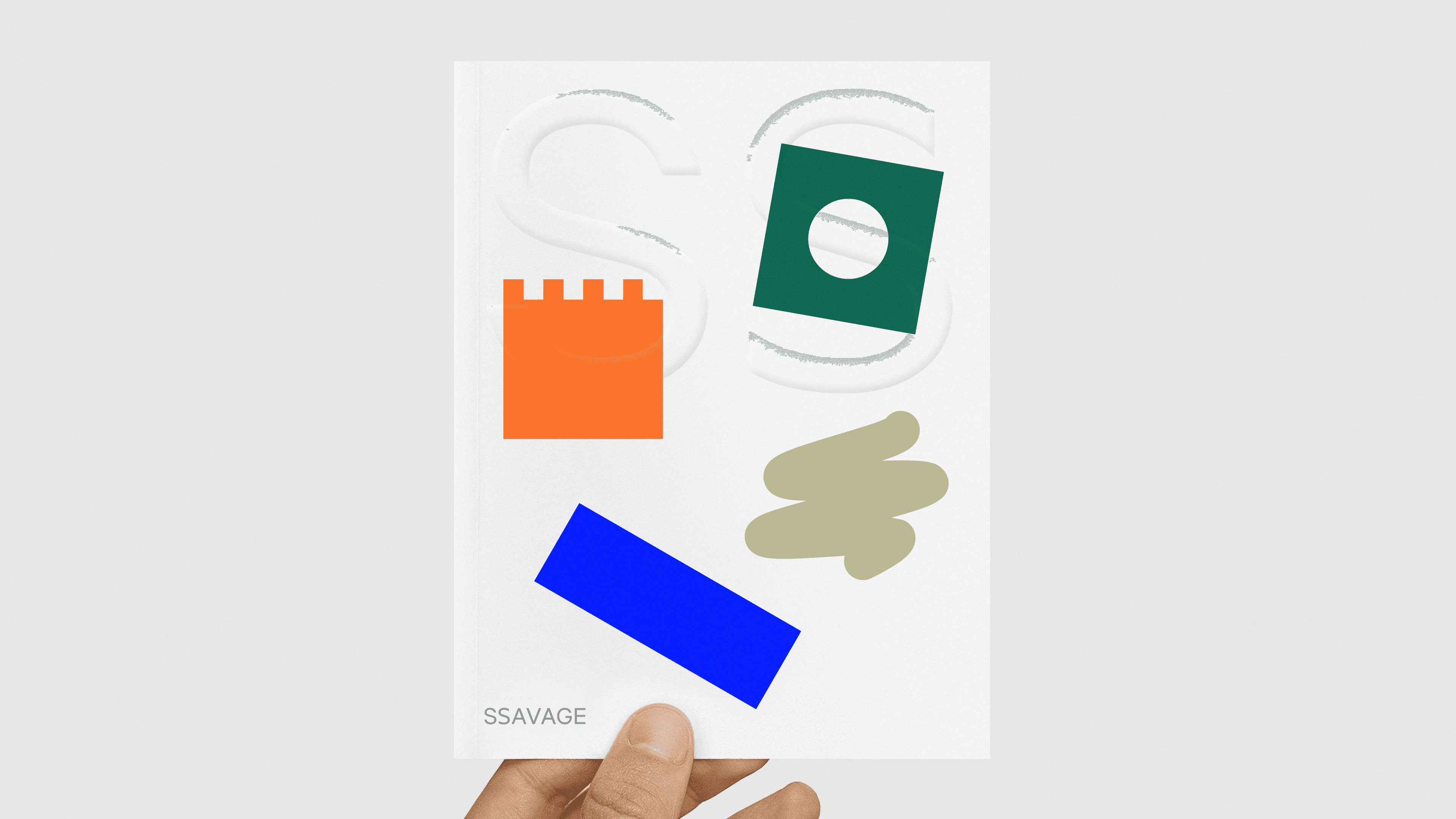
SSAVAGE
1/4
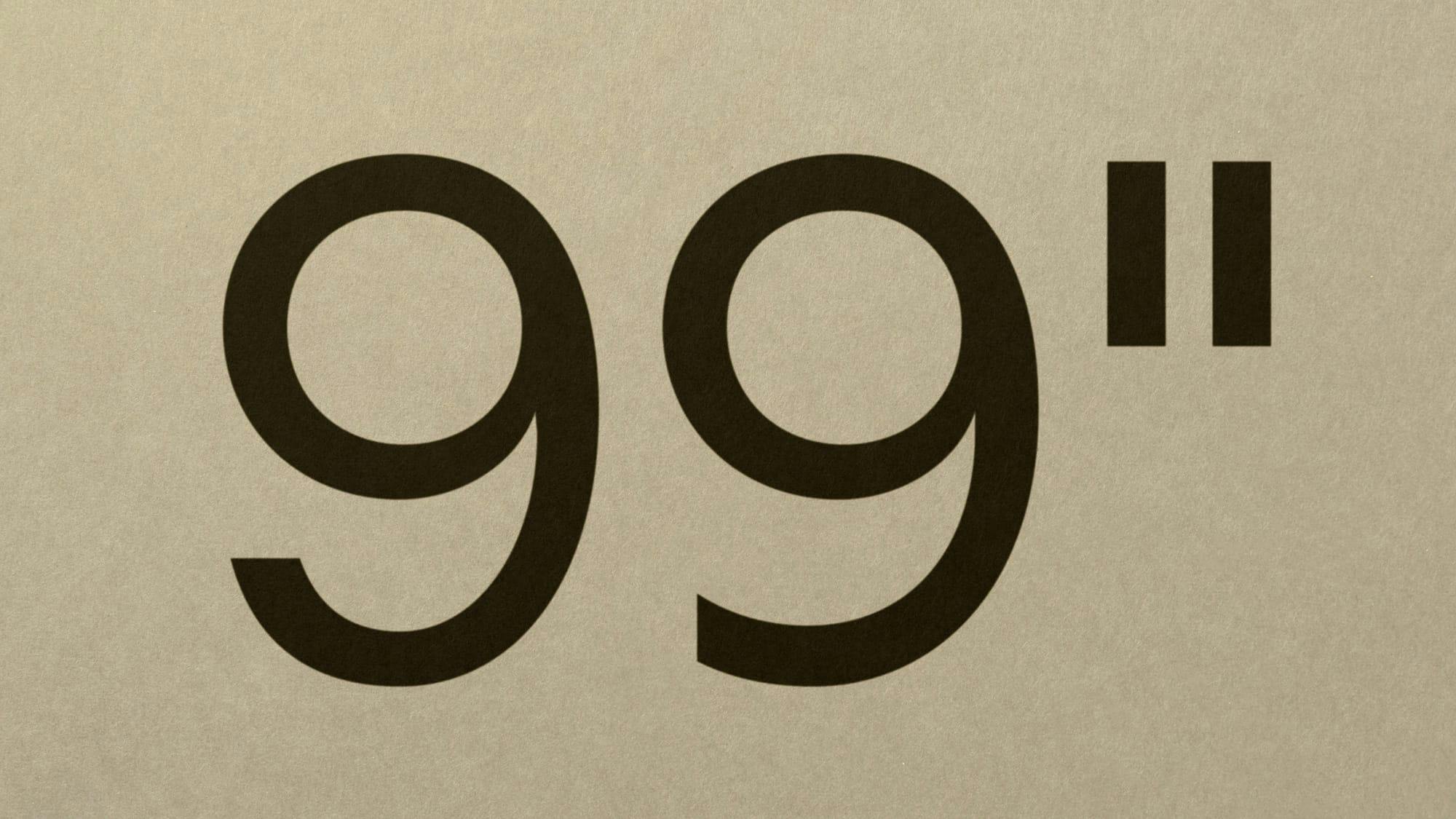
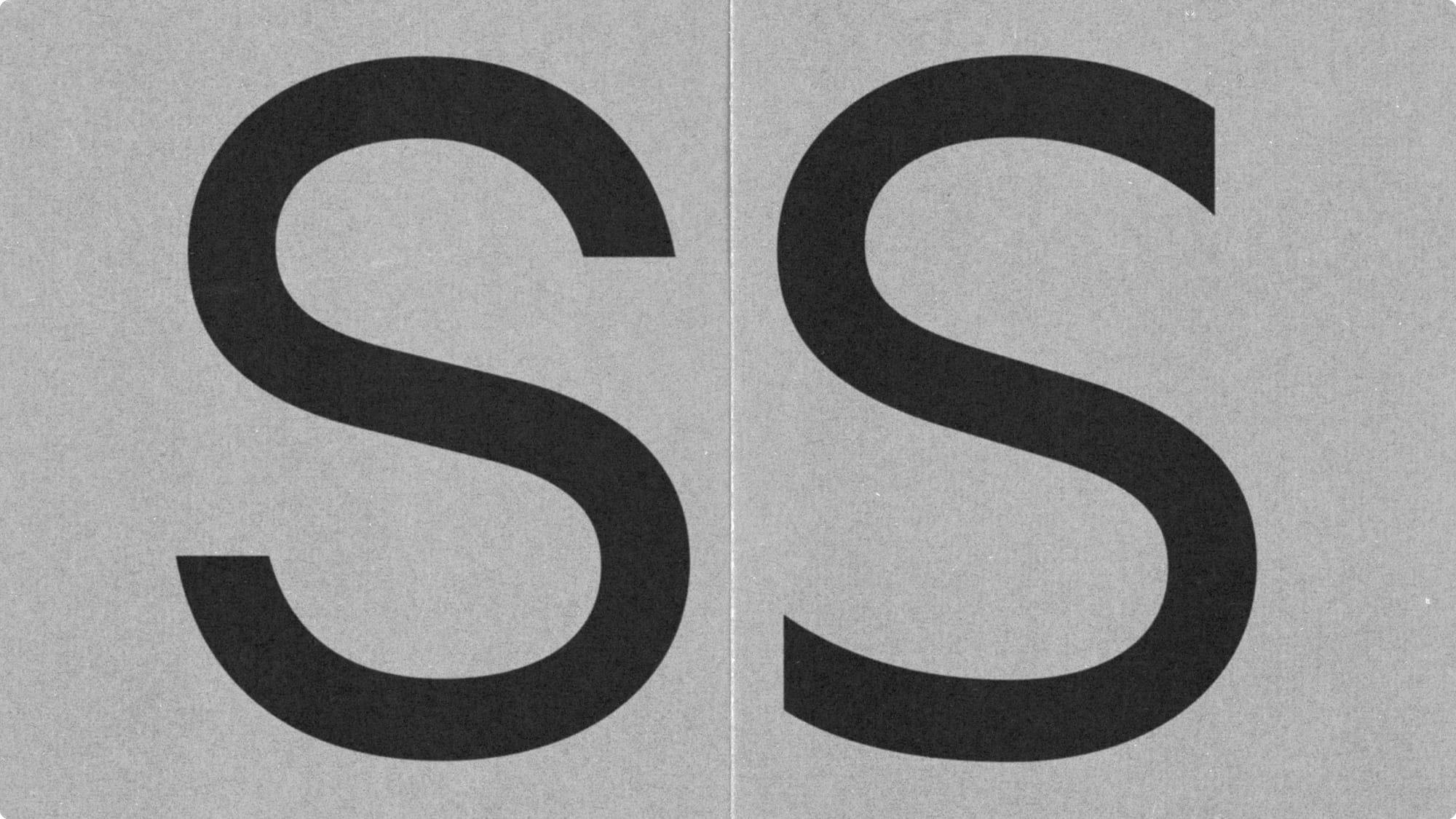
Identity system and custom typography for a furniture (as in objects for home and office) design studio. The two different cuts to the S from the wordmark are carried through various other characters, alternating as they appear.
Art Company Mono
See full project1/1
The product of embracing monospace serif constraints. Art Company Mono comes in four weights with corresponding italics.
Release: 2023
Credits: Regan Johnson (design), Ruggero Magrì (design and production)


